
American Truck
Business Services
A rebrand built to earn trust, spark pride, and stand the test of time.
ATBS had history — they just needed a re-brand that could carry it forward. I set out to create a visual identity that honored longtime clients while making space for the next generation of drivers. I leaned into the beauty and pride of the open road — bold typography, a palette that nods to Americana, and a digital-first system that works as hard as the people it serves.
A Brand That Goes the Distance
Services
Full Rebrand
Brand Positioning
Print + Web Design
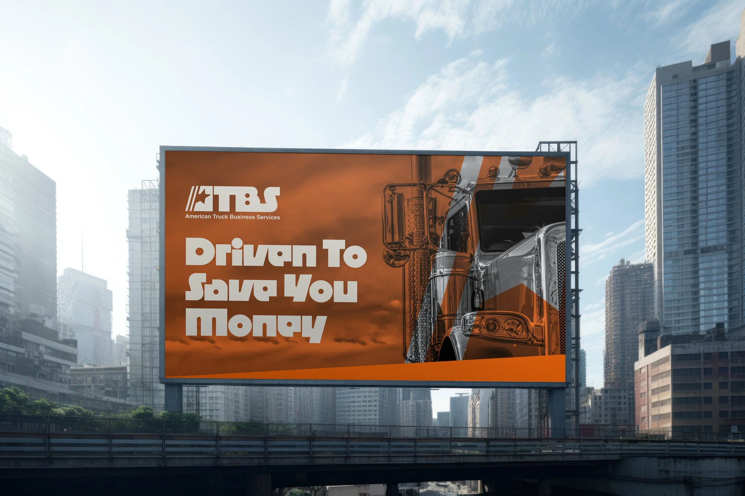

Crafting a Mark That Moves

Parallel lines cut through this mark, borrowing directly from pavement markings. ATBS keeps your business "between the lines", safely moving forward in the right direction. The connected letters create a continuous line the eye can follow, symbolizing not only the open road, but the seamless "don't even think about it" level of service ATBS provides. The ultra-bold design brings a no-nonsense, self-assured energy that sets the brand apart and commands attention.
Red, White &
Built to Last

This bold palette pulls straight from vintage Americana — think old diner signs, sun-faded rigs, and the open road. These classic colors don’t just catch the eye; they carry a message: ATBS is built on tradition, rooted in the industry, and ready to ride with today’s drivers. It's a look that feels familiar, dependable, and proud — just like the people it’s built for.


Born in the
Driver’s Seat
The ATBS team comes from the trucking world, not spreadsheets and boardrooms. Their mission statement inspired the core of the rebrand: “Financial guidance from trucking experts who know the road.” It’s more than a tagline — it’s what sets them apart from advisors who’ve never spent a day behind the wheel.
