MIT Professional
Education
Unifying six distinct programs under one world-renowned institution
Strategic Design for a World-Class Institution
What started as a bold idea—“What if we pitched a brand refresh to MIT?”—grew into a fully realized visual system now rolling out across all of MIT Professional Education’s digital and print channels. The goal: create a flexible identity that clearly distinguishes six unique programs while still aligning with MIT’s established legacy of excellence.
I owned this project from end-to-end—shaping the concept, securing internal alignment, and directing our six person design team on rollout and beyond. The result is a distinctive visual system that’s built to flex, ready to grow, and speaks directly to a global audience of forward-thinkers.
Services
Brand Refresh
Art Direction
Design System Creation
Print + Web Design
See It In Action
professional.mit.edu
instagram.com/mitprofessionaled

A Smarter System, From the Ground Up
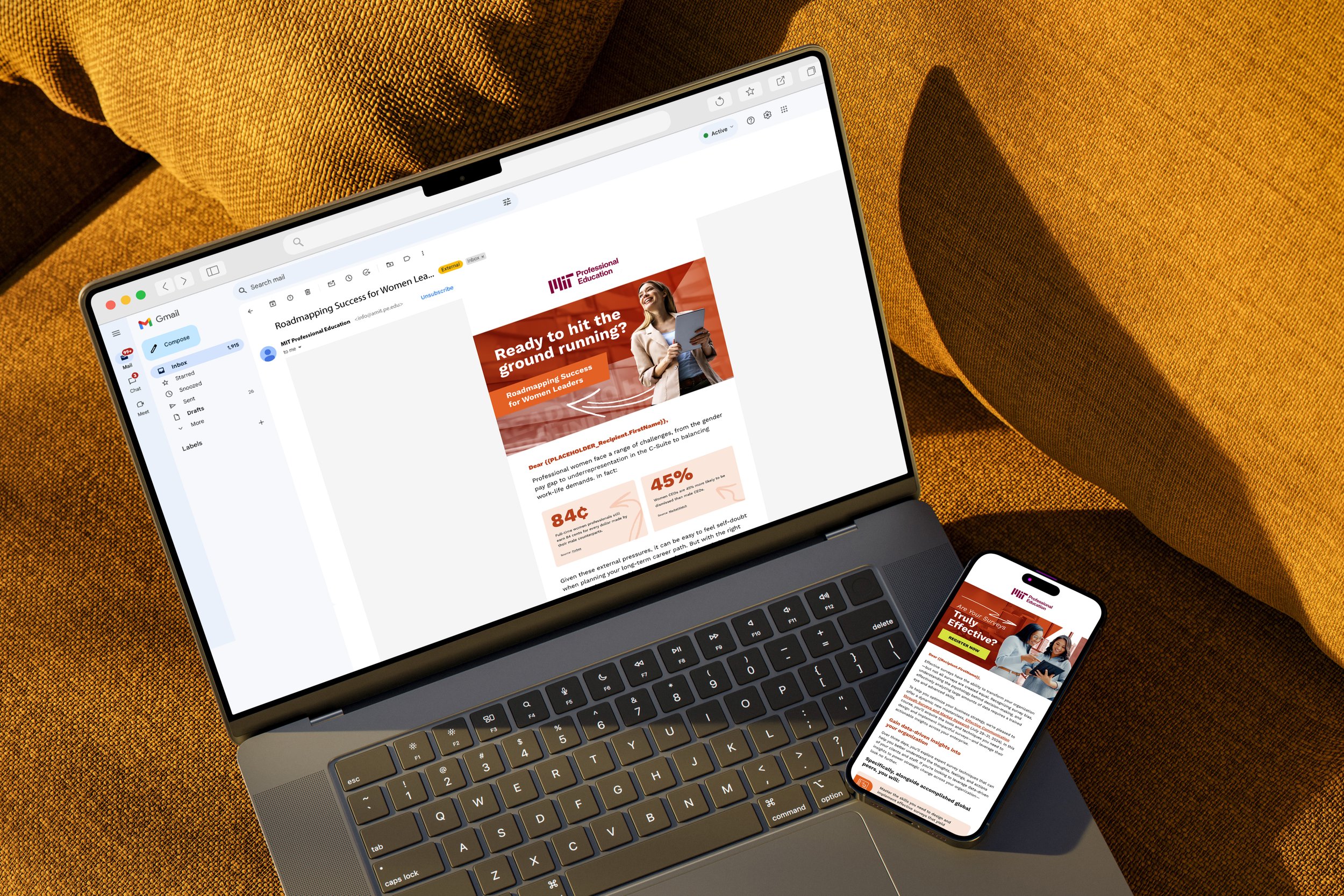
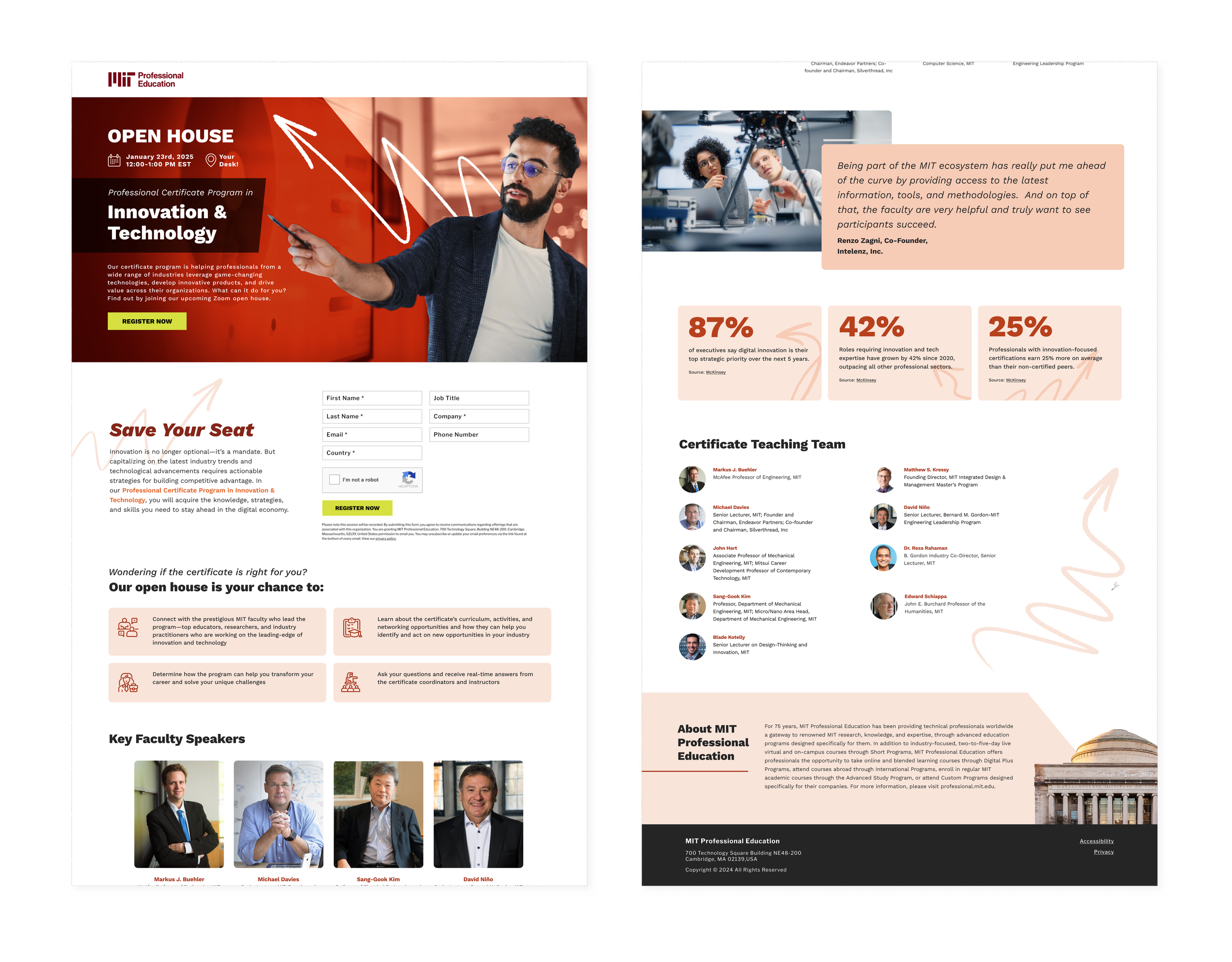
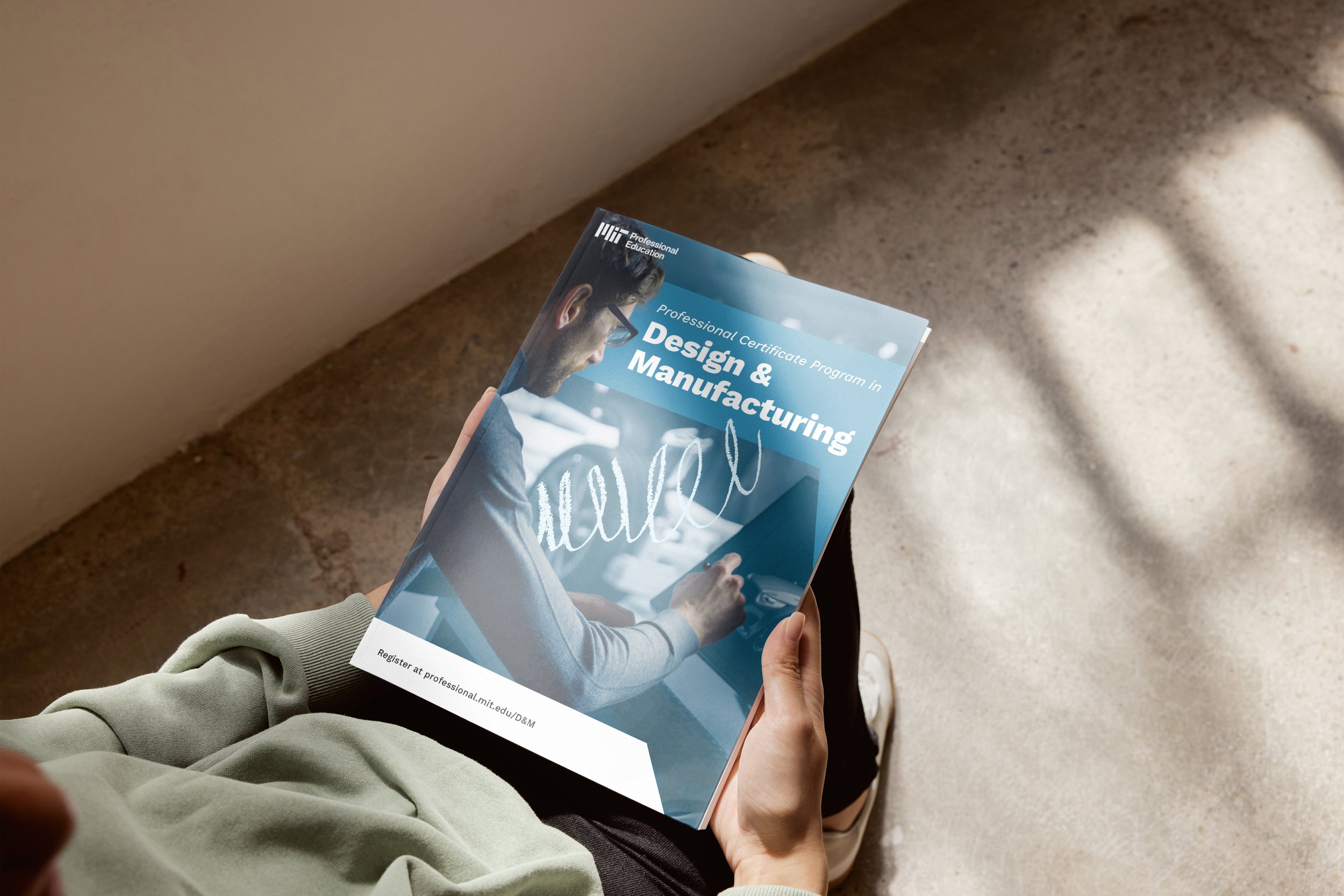
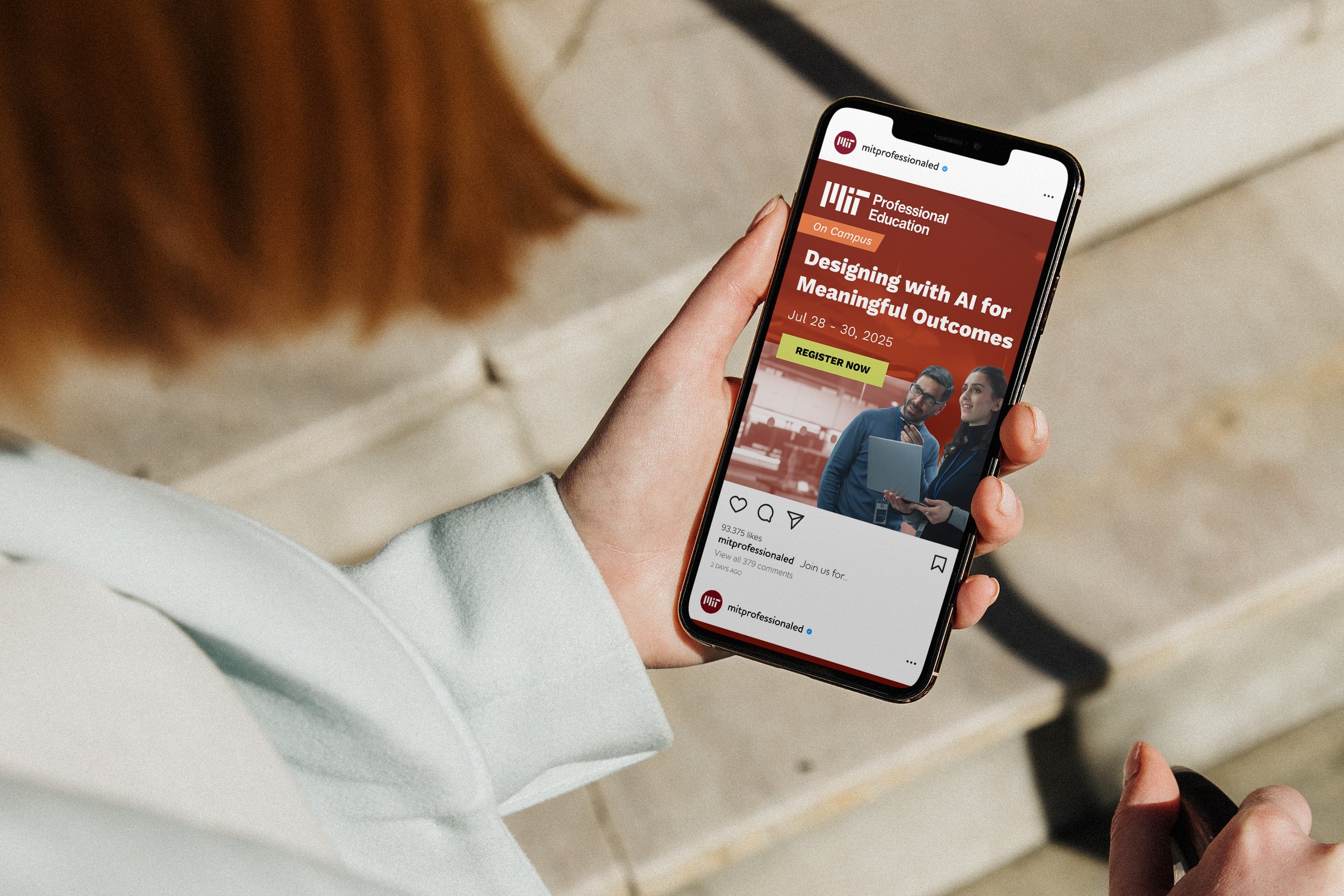
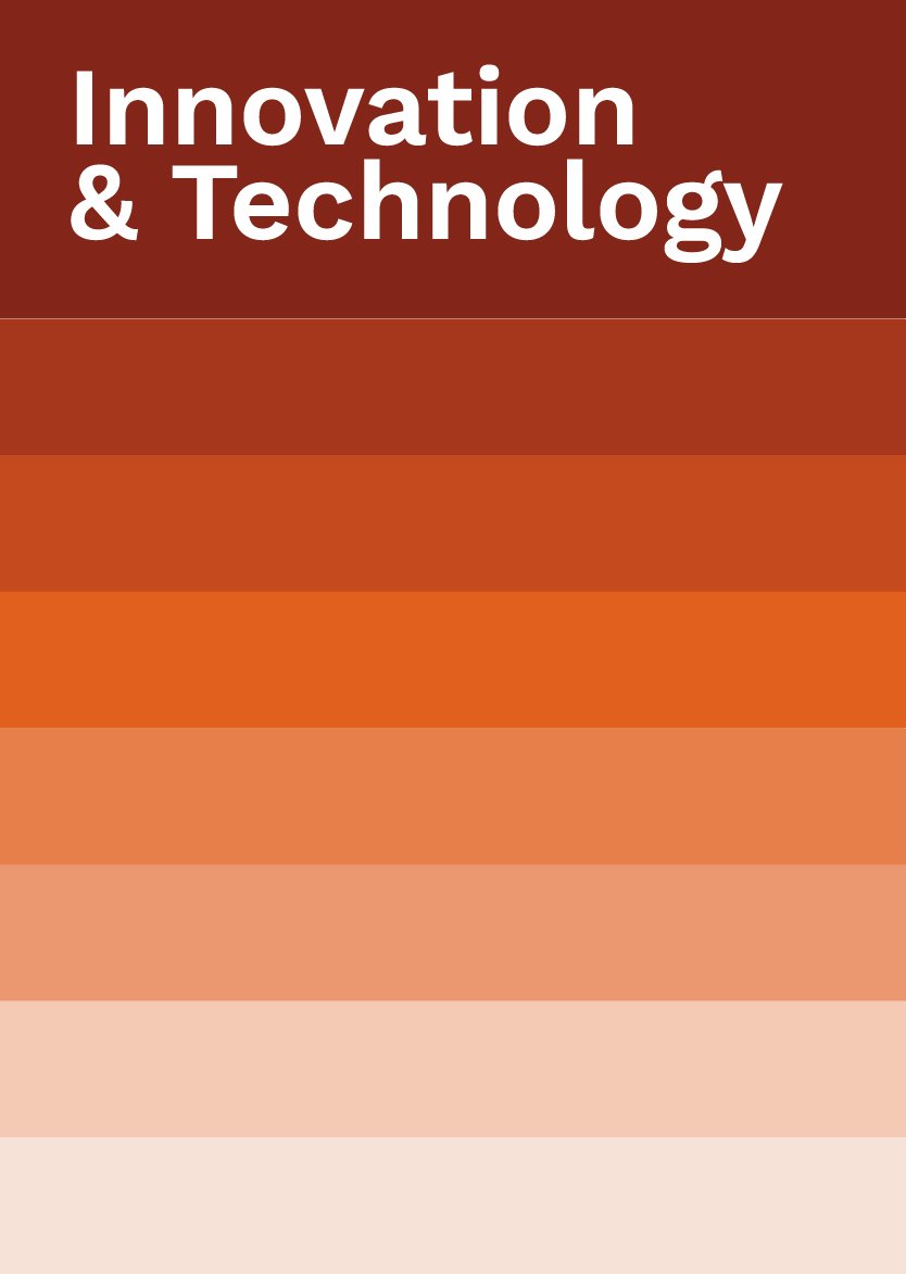
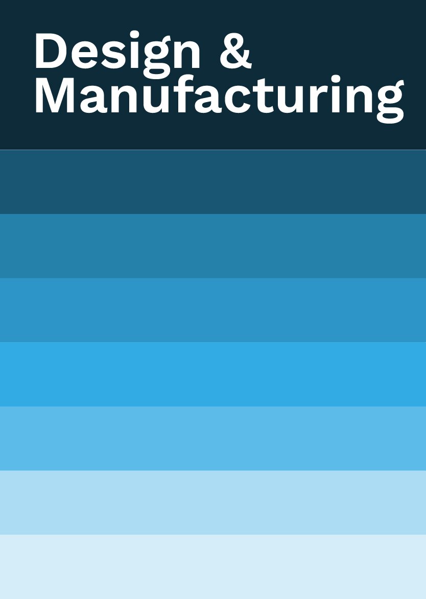
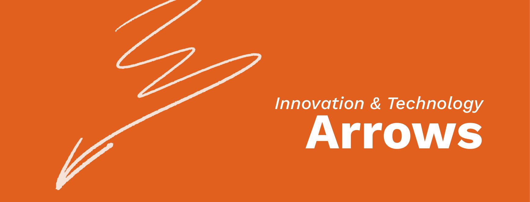
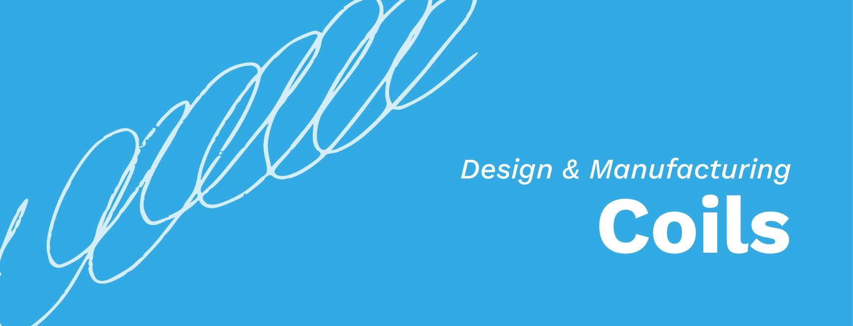
This refresh strengthens MIT Professional Education’s positioning by visually aligning with its core values of innovation, expertise, and real-world impact. A strategic use of distinct color palettes for individual courses provides prospects a clear vision of what certificates are on offer and how they apply to their career. Hand-drawn shape language reflects the program’s commitment to tangible, real-world advancement. Consistent typography and layout keep the brand cohesive under the MIT umbrella.


Design That Moves People
Aspirational lifestyle photography brings humanity to the brand and invites the audience to imagine their future post-program. Sketchy, tangible shape language contrasts with the otherwise clean, structured visuals—echoing MIT’s hands-on teaching approach and the real-world impact students are poised to make. By modernizing the brand’s look and feel, we reinforced MIT’s position as a leader in professional education and opened the door to deeper engagement with professionals ready to shape what’s next."

Hands-On from Kickoff to Launch
Once we had buy-in on the refresh, I stepped in as creative director—leading a team of six designers and overseeing all MIT-related design work. From brochures and banners to landing pages, emails, and brand guidelines, I reviewed every asset for consistency and quality, gave final approvals, and stayed closely involved from kickoff to launch. That included collaborating with project coordinators, responding to client feedback in real time, and guiding the team through refinement and execution.


Turning Vision Into a Visual System
Before pushing the first pixel, I focused on understanding the core of MIT Professional Education—its purpose, its people, and its promise. This isn’t just another continuing ed program—it’s where cutting-edge research meets real-world application. I dug deep into what sets them apart: hands-on learning, direct access to world-class faculty, and a relentless focus on impact. My goal was to take those abstract concepts and translate them into something people could see, feel, and immediately connect with. That meant building a visual language rooted in clarity, credibility, and forward thinking—balancing MIT’s academic weight with an approachable, real-world tone appropriate for the audience of working professionals. The result is a brand system that reflects MIT’s rigor, speaks the language of professionals in the field, and makes space for each program to shine—all without straying too far from the prestigious and valuable MIT brand.